Orchard
the knowledge layer
Who
The Partner.
Defining the company and their sector.
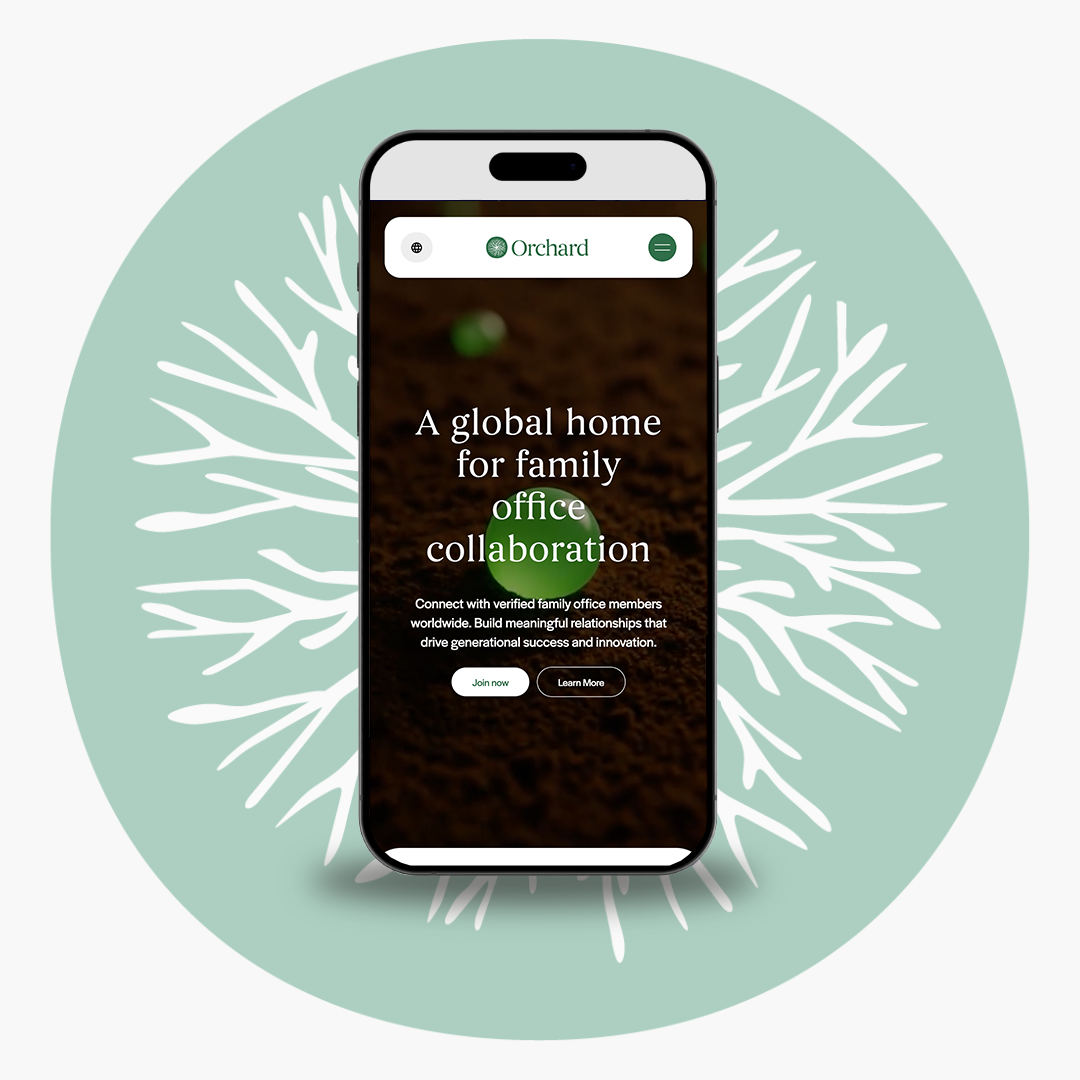
A transparent global community and intelligence network for legacy-driven family office members.
What
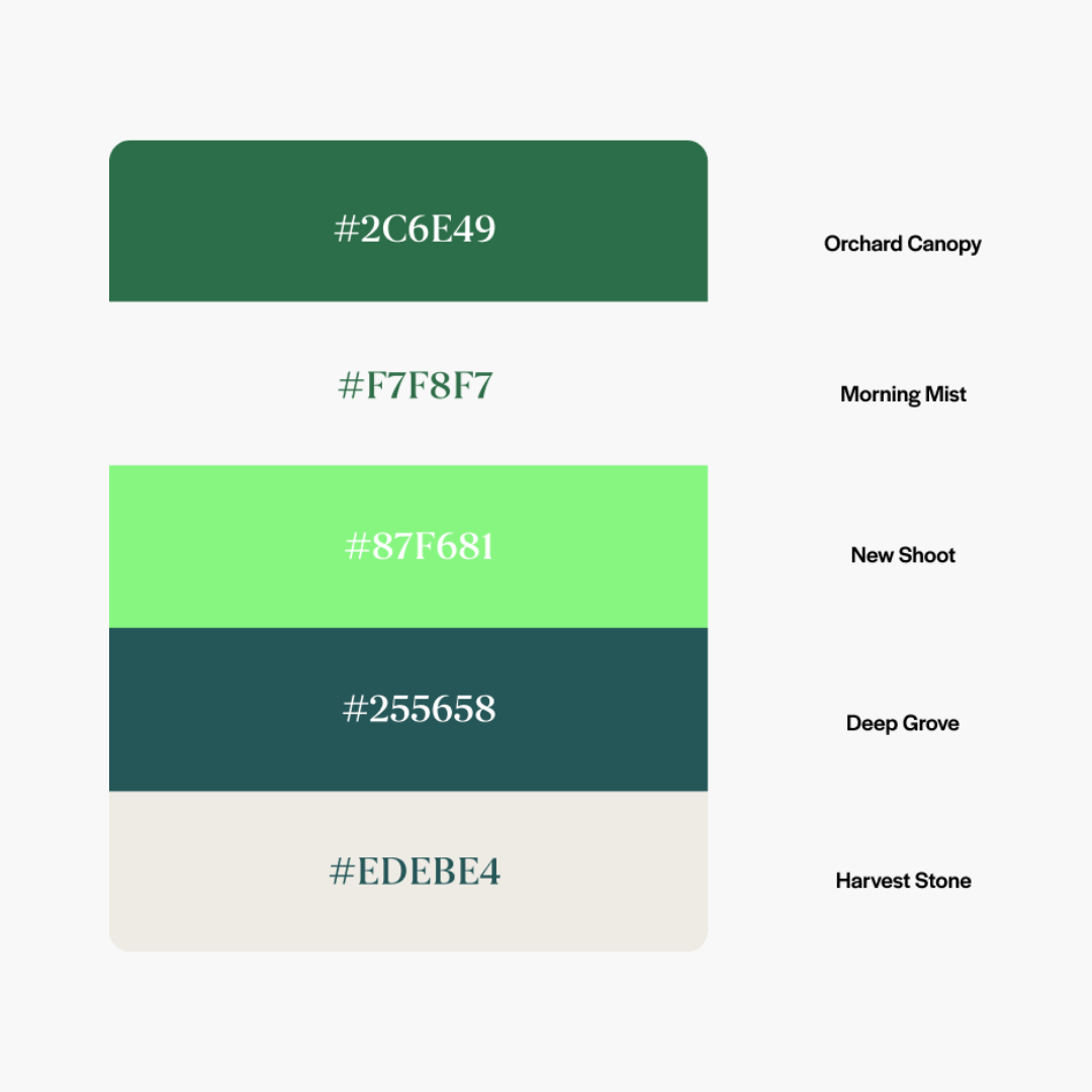
The Build.
The structural elements of the brand.
A grounded brand visual system built on transparency, integrity, and purposeful growth.
Why
The Objective.
The reason for the shift.
Orchard required a systematic brand identity to thoroughly verify and facilitate high-trust interactions within a traditionally elusive and fragmented wealth sector.