Your Science Is High-End. There's No Excuse for a Website That Isn't.
Platforms like Higgsfield have removed the production barrier that used to explain why deeptech websites looked underbuilt. Paired with a designer who sets the message, the visual idea and the standards, a pre-seed to Series A company can now launch a site that looks as serious as its science. The tools alone produce generic output, so the designer's direction is what makes the result credible.
The Old Excuse Was Real. It Isn't Anymore.
For a long time there was a fair reason deeptech websites looked underbuilt. Cinematic visuals, 3D renders and motion meant a studio, a crew, a few weeks and a budget most early-stage companies would rather put into the next experiment. So founders shipped a template, told themselves the science speaks for itself, and got back to the lab.
That trade made sense when the alternative was expensive. It doesn't hold up now. Platforms like Higgsfield can generate cinematic imagery, 3D-style renders and video in an afternoon, and production cost was the main thing standing between a template and a site that looked like the company actually deserved.
What the Designer Adds That the Tool Can't
A generation platform gives you options, not decisions. Left to itself it will hand you a hundred glowing molecules and neural networks, which is the problem, because that's the same hundred everyone else gets.
The designer's job in this setup is to decide what the site says first, which single visual idea carries it, and what gets thrown away. The tool then becomes a very fast way of producing that idea, in the right colour, lighting and materials, consistently across the whole site. Same taste and direction as before, just without the production schedule attached.
Your Reader Can't Audit the Lab
An investor, a senior hire or a potential partner can't check your data in the first ten seconds. They check what they can see, and the website is the only part of the company in front of them at that point. A template that looks like everyone else's doesn't say the science is weak. It says nobody has looked after the parts of the company a reader can actually judge, and readers make that jump quickly.
That's what makes a high-end site worth having at this stage. It isn't decoration, it's the visible half of the credibility the science has already earned.
What the Process Looks Like
It starts with the message, not the imagery. What does the company make possible, in one line, written for someone who gives the page five to ten seconds? Then comes the art direction: one visual idea, a palette, a lighting style, a material language. Only after that does the generation happen, and it happens inside those constraints, so hero visuals, background motion and product-style renders all look like they belong to the same company.
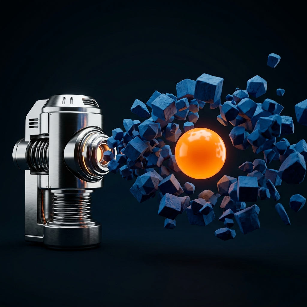
The designer curates what comes back, throws out most of it, and builds the rest into the site. What used to be a production shoot becomes a working session. The hero images on this blog are made exactly this way.
What It Doesn't Fix
A better-looking site with a mechanism-first message still loses. Polish on top of the wrong story just makes the wrong story look expensive, so the order matters: message first, visuals second.
One rule worth holding onto in a scientific company: generated visuals are atmosphere and metaphor, never evidence. No invented instruments, no fake data, nothing a reader could mistake for a result. The imagery sets the tone, and the real proof stays where it belongs, in the data and the named people behind it.
The Transferable Lesson
Put your homepage next to another company at your stage and ask which one looks like it has the more serious science. If it's the other company, the reason used to be budget. It mostly isn't anymore.
Ready to tell your story
Let's build a narrative that moves people and drives results